Contents
- 1 How Liz Toonkel Crafts Immersive Worlds That Feel Authentic
- 1.1 Interior Design: How did you get started in your career, and what inspirations have you leaned on to sustain many varied projects over the years?
- 1.2 ID: Toward the start of the movie Skincare, celebrity skincare guru Hope Goldman notices that a new shop across the way has installed a neon sign, which surprises her as being potentially inappropriate. What does neon mean to you and how have you used it in your work?
- 1.3 ID: In the film, Angel’s skincare studio across the street from Hope’s is positioned as a rival, potentially a dangerous one. When designing both skincare studios, how did you highlight their differences?
- 1.4 ID: The film also includes several residences as well as a TV studio. How did you work to ensure those sets reflected the characters and enforced the narrative?
- 1.5 ID: Can you tell us about your research process for Skincare?
- 1.6 ID: What did you learn about the skincare industry through working on this film, and how did you bring that knowledge to designing these sets?
- 1.7 ID: Can you tell us about how you wanted to support the narrative through the setting of Los Angeles?
- 1.8 ID: You also recently worked on the film Emily the Criminal, also set in Los Angeles. Can you tell us about that project and how LA was depicted in those sets?
- 1.9 ID: And can you tell us about your recent work for the Hulu motel project?
- 1.10 ID: Your career has been varied, including experience in film, TV, advertising, performance, theater, visual art, as well as magic. What’s next for you?
Hulu Motel, production design by Liz Toonkel.
Production designer Liz Toonkel has contributed to over 40 projects across disciplines. Focused on building immersive worlds, her credits include the 2022 thriller Emily the Criminal and the 2021 Oscar-nominated feature Marcel the Shell with Shoes On. Born in Chappaqua, New York, she studied at New York University (NYU)’s Tisch School of the Arts and the California Institute of the Arts in Art & Technology and Scenic Design (CalArts). In her projects, she works to design spaces where the production design creates a feeling that enhances the film.
Among Toonkel’s recent projects, she led production design on the 2024 thriller Skincare, directed by Austin Peters, which focuses on L.A. facialist Hope Goldman who begins to believe that her rival, Angel Vergara, is acting to sabotage her business and destroy her life. For the film, Toonkel created sets inspired by real life in Los Angeles, the birth of beauty culture, and the trends seen in beauty and design magazines in 2013. Skincare is currently available for streaming.
Interior Design speaks to Liz Toonkel about her varied career, her work on Skincare, and drawing inspiration from Miley Cyrus’s 2013 Bangerz cover.
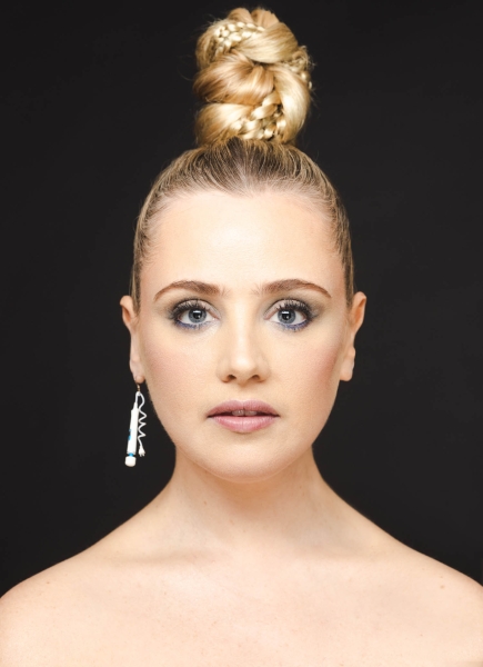
Production designer Liz Toonkel.
How Liz Toonkel Crafts Immersive Worlds That Feel Authentic
Interior Design: How did you get started in your career, and what inspirations have you leaned on to sustain many varied projects over the years?
Liz Toonkel: Growing up, I was a dancer and musical theater performer. I loved movies and would make films on my friend’s family video camera. I decided to study film at NYU because it felt like a medium that incorporated all of my interests. At NYU, I wrote and directed my own films, and collaborated with peers on their projects as a production designer. Then, I worked in film and television in New York for two years. After earning my master’s degree at CalArts in both Scenic Design and Art & Technology, I continued to balance collaborating as a designer and creating my own work, mostly in solo performance.
I worked my way up, starting as a production designer on tiny projects and simultaneously assisting established designers on larger ones. I have been lucky to collaborate with many of my film school peers on special films like Marcel the Shell with Shoes On. I am passionate about telling stories that reflect, comment, and contribute to our culture. And I’m inspired by learning about different people, and observing the way they inhabit space and how those spaces communicate who they are.
ID: Toward the start of the movie Skincare, celebrity skincare guru Hope Goldman notices that a new shop across the way has installed a neon sign, which surprises her as being potentially inappropriate. What does neon mean to you and how have you used it in your work?
LT: When I received the script for Skincare, it didn’t include a neon sign. I strove to be as accurate to the look and feel of 2013 as possible and wanted her rival Angel Vergara, and his salon Shimmer, to be cutting edge. While researching, I discovered that one of the biggest design moments of 2013 was Miley Cyrus’s Bangerz cover, which featured the album title in pink neon. That cover was the biggest influence on Shimmer and the neon sign is the focal point of the space, really evoking that moment in time. The director Austin Peters loved this idea when I pitched it and wrote the neon sign into the script afterwards. The neon sign in Skincare points to how Hope is stuck in an older social structure and is aghast at how the world is changing around her.
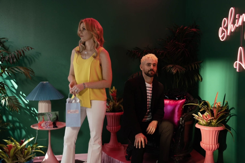
Angel Vergara’s Shimmer studio in Skincare, production design by Liz Toonkel.
ID: In the film, Angel’s skincare studio across the street from Hope’s is positioned as a rival, potentially a dangerous one. When designing both skincare studios, how did you highlight their differences?
LT: I started with researching the period, knowing I would find answers about how to create the stark differences between them aesthetically. I immediately thought that Hope’s salon should have been renovated a few years prior, finally settling in 2010, and that Angel’s would be constructed right at that moment, 2013, highlighting the clear ideological divide between the two of them. With Hope’s salon, I pulled a lot from the aesthetician Kate Somerville’s book Complexion Perfection! from 2011. Her career is really in line with Hope’s, so her aesthetic fit perfectly: silvers, whites, Buddhas, reflective surfaces, a feminine airy feeling in the lobby, which is then juxtaposed with the Zen green and earth tones of the treatment room.
Angel’s salon makes Hope’s feel dated. Hope’s is a place of business and Angel’s is a party. It is less about the work happening there and more about Angel selling himself, which is right on brand for Hollywood and the beauty culture of the moment. It reflects the height of the times and again, the Miley Cyrus iconic Bangerz album cover, with its jungle green walls, hot pink accents, and lots of tropical plants.
ID: The film also includes several residences as well as a TV studio. How did you work to ensure those sets reflected the characters and enforced the narrative?
LT: When it came to the homes of the characters and the other spaces throughout the film, it was vital to show how each character is on their own journey of “making it.” Some have achieved that success and are in the process of losing what they’ve made, and some are faking it till they make it. Again, period research helped me to find the differences between these spaces. For Hope’s home, I decided it was renovated in 2009 (a stark mix of black, white, and red) while Angel’s was built in 2013 and flamboyantly so (chains in the guest bathroom instead of a door, a disco ball in the living room, jewel tones, animal prints). Hope is stuck in the past while Angel is already in the future.
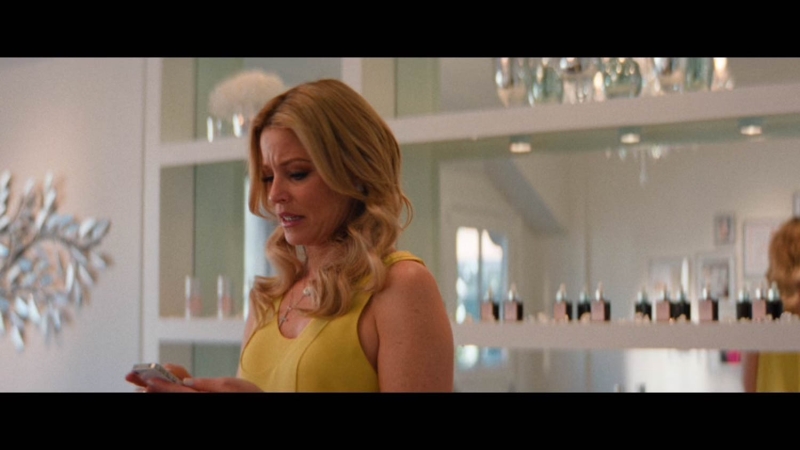
Hope Goldman’s studio in Skincare, production design by Liz Toonkel.
ID: Can you tell us about your research process for Skincare?
LT: Even though 2013 was only ten years ago, the aesthetic was incredibly different from now. Magazines were my biggest resource, and I combed through them, taking in how looks changed from the early aughts through and beyond 2013. I also spent a lot of time watching reality TV and movies of the era like The Hills, The Rachel Zoe Project, and The Real Housewives of Orange County and Beverly Hills. Shows with people in similar states of ambition and desire as the characters in our film. I was struck by the fonts, layouts, and color palettes of beauty spreads from the era and how they reflected the popular colors of the time.
ID: What did you learn about the skincare industry through working on this film, and how did you bring that knowledge to designing these sets?
LT: It’s really interesting that this film came out at a time when skin care was such a hot topic. The movie takes place at a moment when beauty culture was really shifting, and the current moment highlights how much the world of beauty is ever evolving. As a longtime skincare enthusiast, I had a knowledge base that I was excited to bring to the film.
I consulted with my facialist about her space and took inspiration from the details, including all the equipment and tools of the trade. And we consulted with beauty expert Liliana (Lana) Felleti, who provided some of the equipment and was present during the construction of the salon as well as for the shooting of the treatments. I learned a lot from them and have an even deeper appreciation for their skillsets.
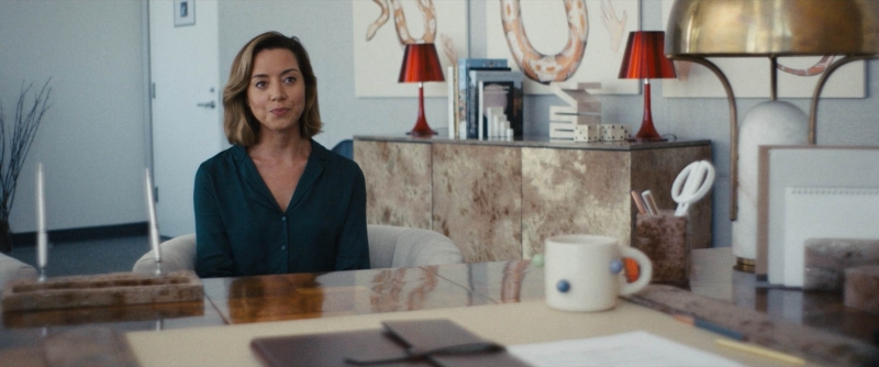
Emily The Criminal, production design by Liz Toonkel.
ID: Can you tell us about how you wanted to support the narrative through the setting of Los Angeles?
LT: As an Angeleno for almost 15 years, it is stunning to see the difference between the way Los Angeles is portrayed in the media and what the experience of living here is actually like. We wanted to create a real but stylized world that people from Los Angeles could relate to. We were inspired by films that don’t get made anymore, like To Die For, that have strong almost camp aesthetics. And the aesthetic of the paparazzi and reality TV. We are so used to those images that they have become a part of our culture and style, but how could we heighten them to point to the facade of our current American culture?
ID: You also recently worked on the film Emily the Criminal, also set in Los Angeles. Can you tell us about that project and how LA was depicted in those sets?
LT: We sought to capture a side of Los Angeles that is not normally depicted in movies, but that is very real to the people who live here (the real version of Los Angeles I created in Emily was why Skincare director Austin Peters wanted to collaborate with me). This version of L.A. is central to the story because the main characters Emily and Youcef are living on the edge in a place where the American dream is actually attainable by only a select few.
The movie version of Los Angeles that we have grown accustomed to is present in the viewer’s mind, but not on screen because this is what life is like in current day America. Americans have been conditioned to live in a world that no longer exists. To achieve this Los Angeles, director John Patton Ford and I sought out locations that don’t normally get shot for movies. It was important for the characters to live in the realest of places with no glitz or glamour, but that also reflected their humanity. Emily’s apartment is somewhere I and so many of my friends have lived in, but I never see on camera. A shitty liminal space between young adulthood and adulthood.
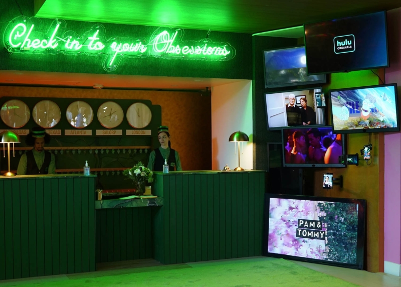
Hulu Motel, production design by Liz Toonkel.
ID: And can you tell us about your recent work for the Hulu motel project?
LT: The Hulu motel was an immersive pop-up experience that I production designed. I have been lucky to design a number of these projects for different IPs and brands over the years. We created the Hulu motel at the Sportsmen’s Lodge and turned the entry, lobby, bar, five rooms, the pool and patio into spaces belonging to their respective IPs. These opportunities allow me to employ the skills that I bring to movies as well as the techniques I utilize in live performance.
When designing this type of event, I start by figuring out how the story of the IP or brand is told through the audience’s movement through space, and deciding how we can best direct them where to go and where to look. These experiences not only give guests a new way to engage with the brand in the moment, but also to capture it from their own point of view on their devices. So, I’m always considering what will be thrilling in the moment and iconic to capture and post on the other hand.
ID: Your career has been varied, including experience in film, TV, advertising, performance, theater, visual art, as well as magic. What’s next for you?
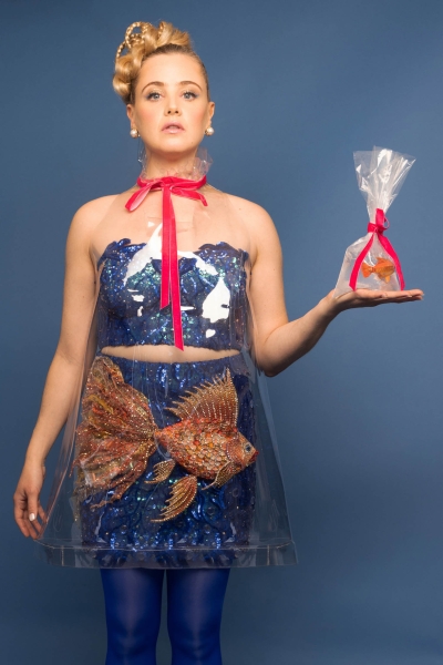
LT: My interdisciplinarity is something I’m really proud of, and I have a lot in the works! I am currently touring my one-woman vegan magic show Magic for Animals. As I tour, I am developing a new one woman show incorporating clowning and magic that I hope to bring to the Edinburgh Fringe in the next year or two. I am currently writing the screenplay for my own feature film that I will direct. Making my own feature has been a lifelong goal of mine and I feel ready to realize it. My film is inspired by my years as a teen with an overflowing and tenacious creative spirit. I can’t wait to birth it into the world! With my production design work, I have some cool stuff coming up, including a couple of films and a comedy special. I feel blessed to continue to make work both as a designer and as my own artist. I seek to keep honing my creative voice and to become more sophisticated at what I do.
Magic for Animals performance by Liz Toonkel.
